
An option in StatusHub is to display an uptime chart for each hub. The uptime is based on the amount of time a service is in a 'disrupted' or 'red' state.
The following example shows how the calculations are adjusted depending on the service state.
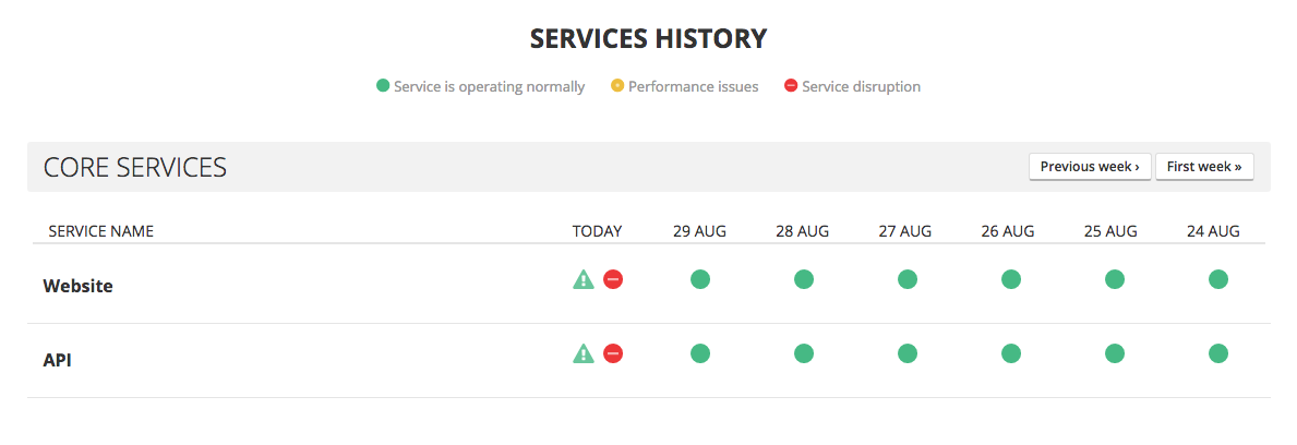
Below are two services which had incidents for the same period of time, 1 hour.
The first incident started in the 'red' state and was updated to the 'orange' state after 20 mins and then was reset to the 'red' state for the final 20 mins of the incident.
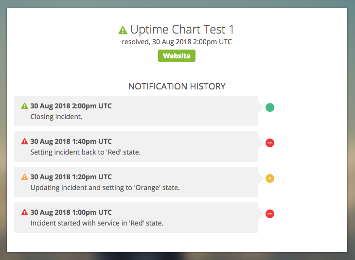
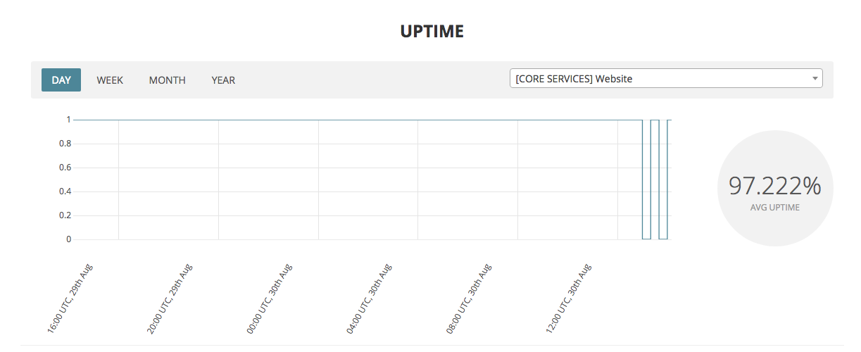
This is now reflected in the chart below. It's showing the two 'red' states for 20 mins each with a combined downtime of 40mins.
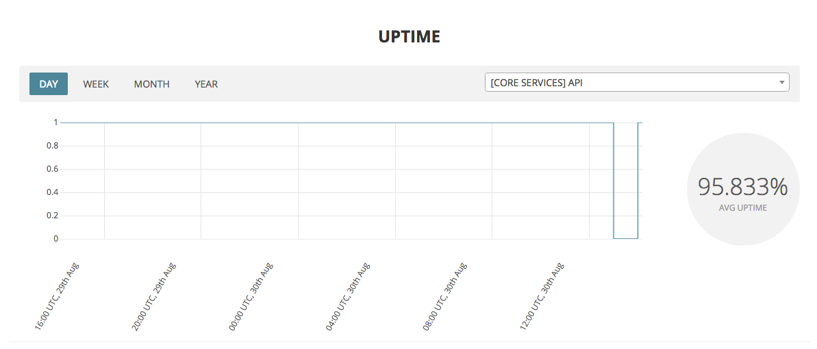
The 2nd incident was in the 'red' stage for the full hour.
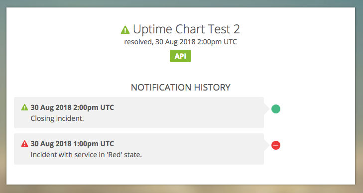
Again this is reflected in the chart and the average uptime percentage displayed is based on the 60mins of downtime for this incident.
As always if you have any questions about this feature or guide please contact us.
Comments
0 comments
Article is closed for comments.